CSS Makeovers
With the arrival of Grid, Flexbox, and more, CSS’s layout powers have undergone a radical but desperately needed makeover. Discover new layout possibilities, and learn from popular sites and common layout patterns redone with Grid and Flexbox.
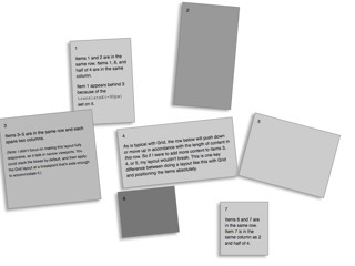
Featured: Replicating a Boston Globe Layout with CSS Grid
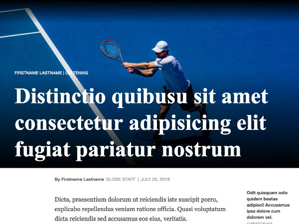
The Boston Globe’s landmark redesign in 2011 ushered in the industry’s move to responsive web design. With CSS Grid poised to make a powerful impact of its own, it’s only fitting that we take a look at how we could replicate one of the Globe’s layouts with Grid.
Read MoreSites, Patterns & Other Layouts
-
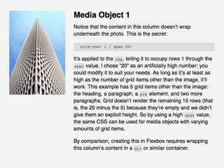
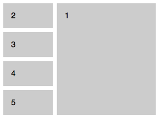
Media Object
The omnipresent media object pattern popularized by Nicole Sullivan, redone in Grid.
-

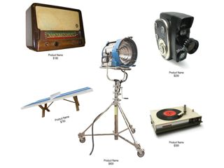
Netflix Module
Replicate a Netflix Homepage module with Grid, and learn when to reorder content sensibly and responsibly.
-

MLB News Page
Replicate MLB’s News page with Grid while mixing in a bit of Flexbox and using position: sticky.
-
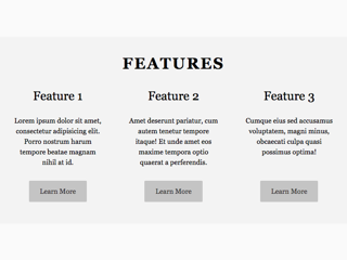
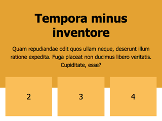
Features Unit
A familiar pattern but with no column wrappers needed—thanks, Grid!
-
Wired Homepage
Learn how to replicate the top portion of Wired’s Flexbox-based homepage with Grid.
-
Catalog Layout
Mimic a minimalist product catalog page with Grid, and break the lines of rigid rows and columns.
-
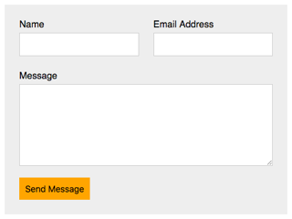
Simple Form
With Grid, just clean, semantic HTML, and no column wrappers in sight!
-
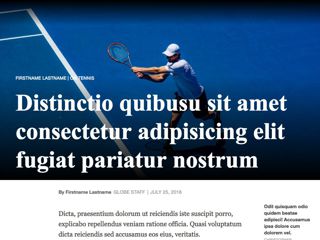
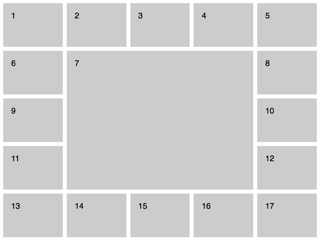
Boston Globe Article
Replicate a Boston Globe article template with Grid, and reduce the HTML required in the process.
-
Hero with Overlappers
Combine Grid and negative margins to achieve this familiar pattern.
-

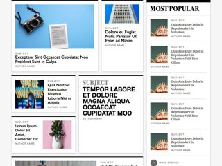
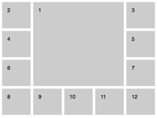
Hulu Mosaic (Grid)
Replace Hulu’s single-image-based promo unit with an accessible, SEO-friendly, Grid-based layout.
-
Hulu Mosaic (Flexbox)
Replace Hulu’s single-image-based promo unit with an accessible, SEO-friendly, Flexbox-based layout.
-
Odd Boxes
Get weird with Grid—it isn’t all about straight rows and columns.
-
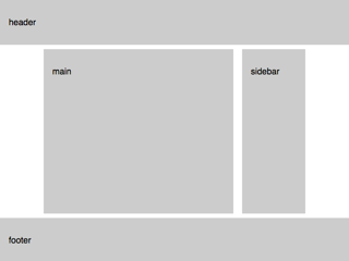
Two-Column Layout
The classic site layout, done with Grid.
-
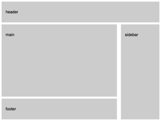
Two-Column Layout with Long Sidebar
Variation on the classic site layout, done with Grid.
-
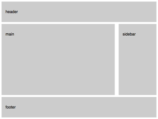
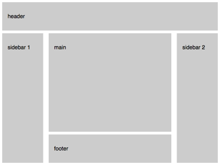
Two-Column Layout with Infinite Header and Footer
A common site layout, done with Grid.
-
Three-Column Layout
The standard three-column layout, done with Grid.
-
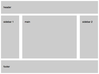
Three-Column Layout with Long Sidebars
Variation on the standard three-column layout, done with Grid.
-
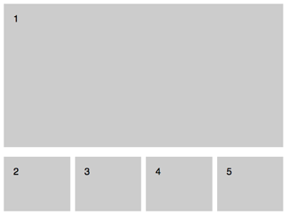
Feature on Top
Another common layout pattern made trivial by Grid.
-

Feature on Top (with Content)
An example of a Grid nested in another one, as well as how to overlap cells to achieve a common effect.
-
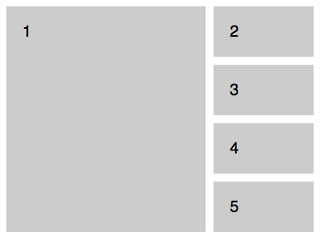
Feature on Left
Another common layout pattern made trivial by Grid.
-
Feature on Right
Another common layout pattern made trivial by Grid.
-
O-in-U
Witness the power of Grid’s auto-placement algorithm with this deceptively simple layout.
-
O-in-O
Position just one item yourself, sit back, and high-five your dog while Grid does all the remaining work.